
The first half of my Japan trip has largely centered around wildlife. Snow monkeys, Red-crowned cranes, whooper cranes, Stellar sea eagles and white-tailed eagles. We even had a arctic red fox and, although I haven’t included them, a couple of Axo deer.
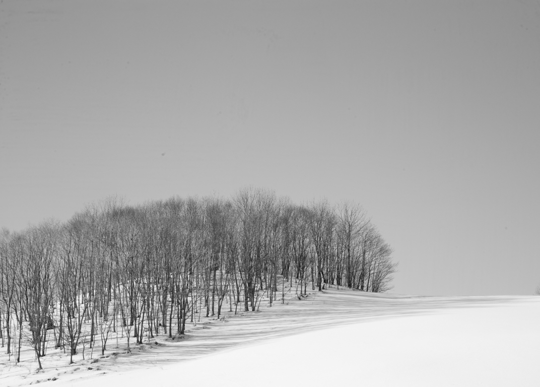
As David and I made our way to different locations we’ve also been looking for interesting landscapes. Today I’d like to offer a variety of images that I’ve made and ask for you opinion. Many of these images could be either color images or black and white ones. I’m going to show you some of them and ask you to tell me whether you prefer the color version or the black and white one. You can simply say “#1 color or #1 b&w’. If you’d like to give your reasoning, that would be great, as well. I would love to hear them. So let’s get started.
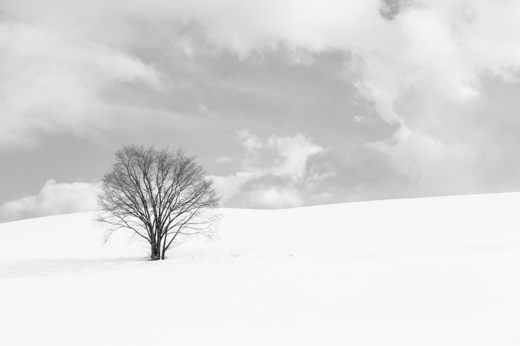
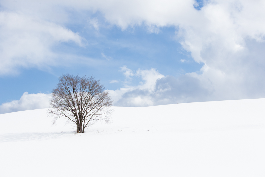
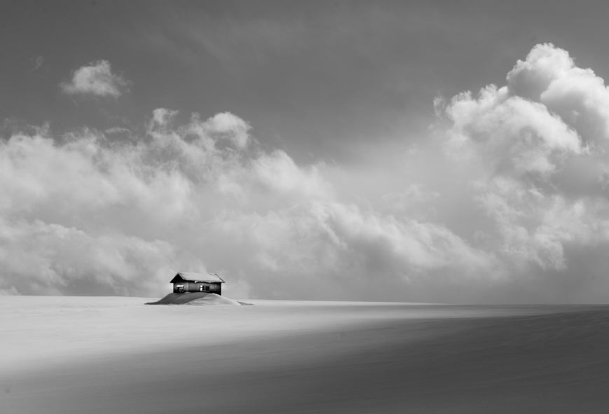
#1 black and white and color.

#2 black and white or color
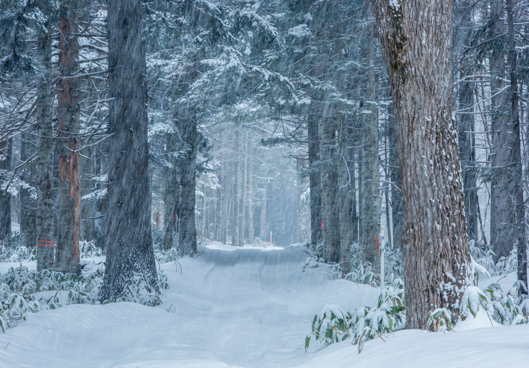
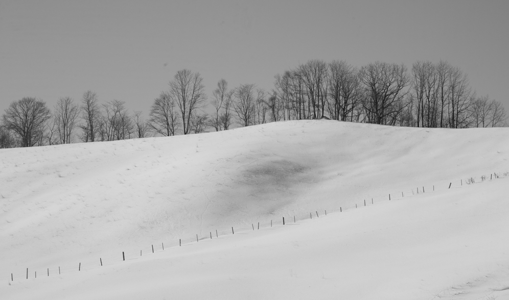
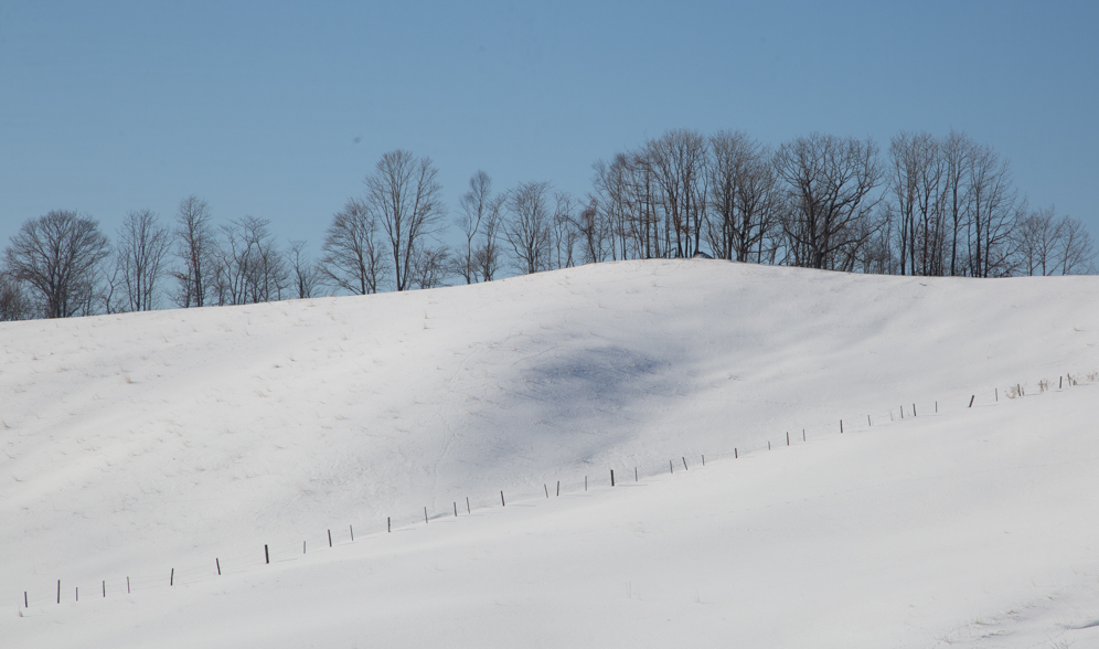
#3 black and white or color

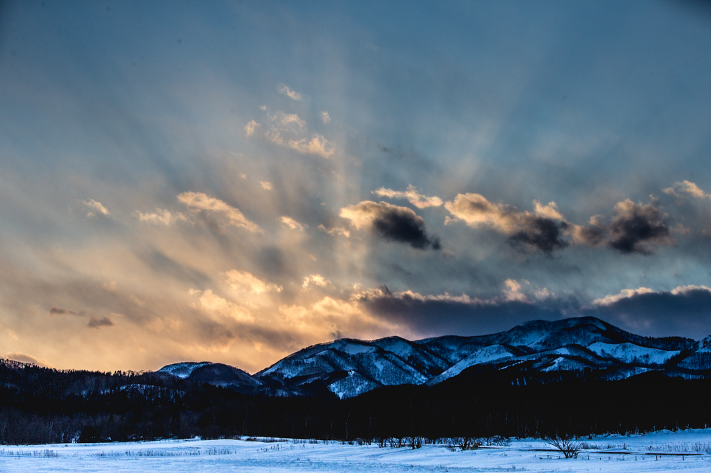
#5 black and white or color
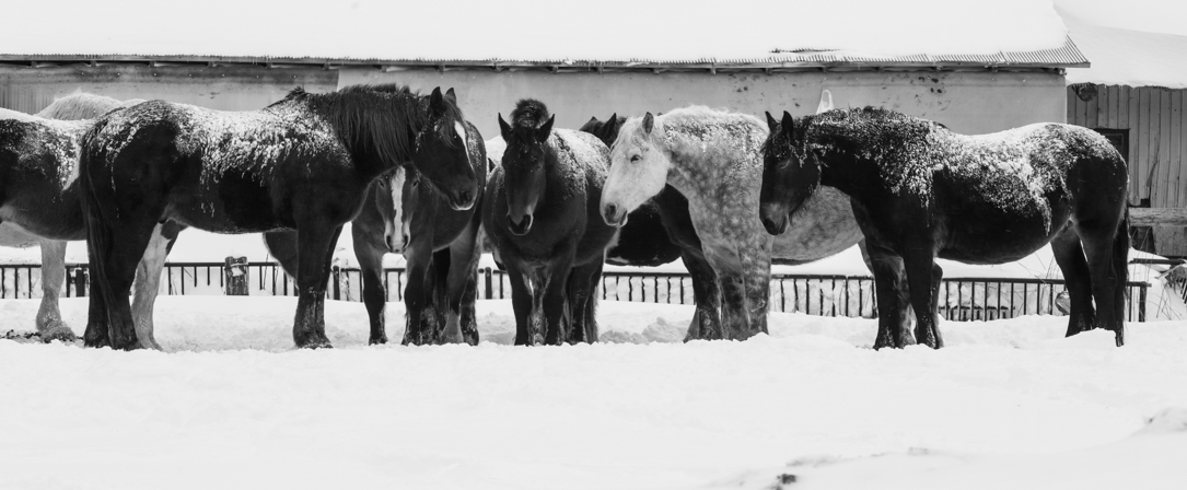
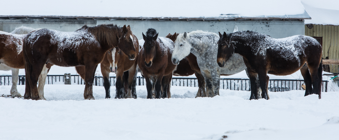
#6 black and white or color

#7 black and white or color

#8 black and white or color.
#9 black and white or color
That’s the end of the test.
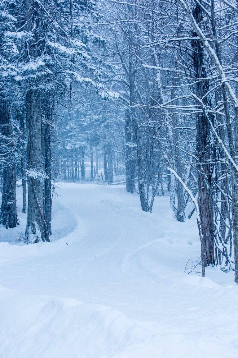
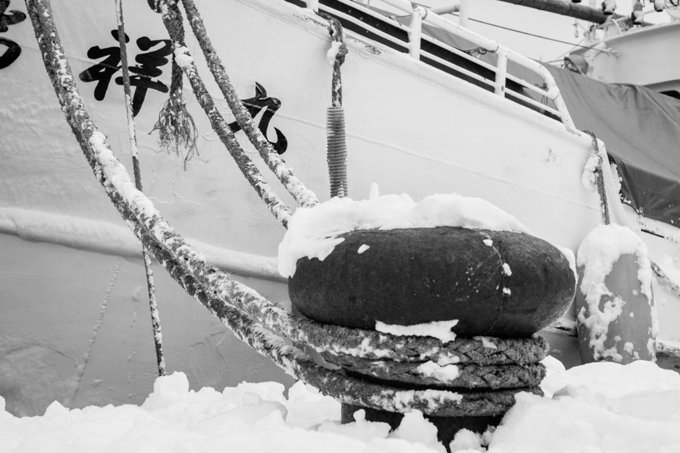
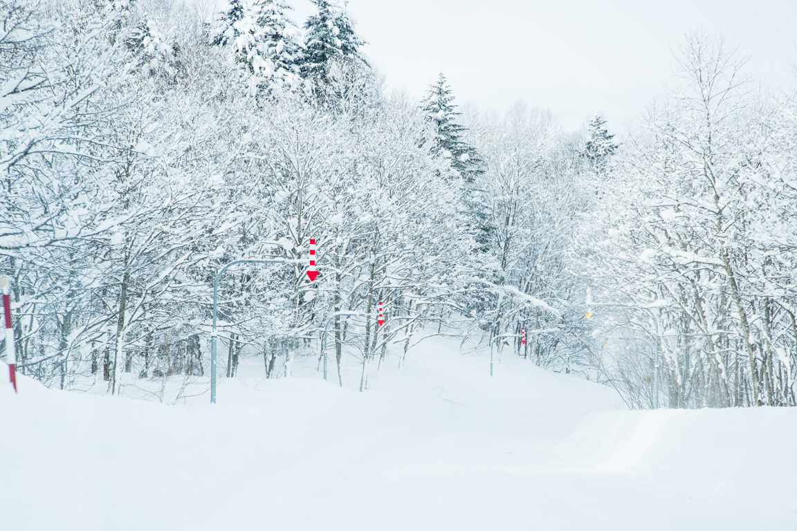
Lastly, here are a couple of other images I made. One is done in black and white of the ship tied to the bollard and the second is in color of a scene shot from the car of the snow covered trees. The color is needed here to draw attention to the down pointing arrows. Those arrows mark the edge of the road for snowplows and vehicles where a painted stripe on the pavement wouldn’t show or a roadside stick might get knocked over by the plows.
Thanks, in advance, for your participation. In my next blog, we’ll move on to our last stop in Wakkanai. The northern most city in Japan.

#1 color because i like the blue sky contrast with the clouds, #2 B n W …i like the richness of the black and white #3 B n W. Just cool #4 You don’t have a #4 #5 color. I think B n W looks too gloomy #6, #7, #8 and #9 i like the color although last one I love both. I like the sun coming through clouds and Ilike the bright blue sky. Happy images.
>
Great study of the power of values!
#1- B/W
#2- B/W: value shift = depth
#3- B/W: Value shift = depth plus the horizontal format works best to draw the viewer in along the winding road
#5- Color: greater contrasts, eye wanders back thru the trees to the snow line
#6- B/W
#7- B/W: values
#8- Color: complimentary colors emphasize the drama
#9- Color: colors are subtle and harmonious adding that extra touch of interest (both versions are strong)
Thanks for taking the time to comment on these images. I appreciate you input.
1 b/w
2 c
3 b/w
5 c
6 c
7 b/w
8 c
9 c
I don’t make decisions very easy (as you know) but here’s my feedback:
1) color
2 & 3 ) black and white
I don’t see a 4
5 and 6 to me are like the eye doctor lady saying choose 1 or 2. I don’t really have a preference.
7 & 8) COLOR! I love these images and the way the blue pops.
9) I like both here also.
1# color
2# color
3# color
5# color
6# color
7# color
8# color
9# color
I loved the color images because color images are showed the good combination. #6 and #7 images are i liked it.